A little while ago, I came across this fun "Jumping Cards" Codepen that was inspired the AirBnB. I thought it was quaint and something that I could possibly borrow for my own work so I thought I'd check it out to see how it was made. Turns out that it looks fairly straightforward - relying on the popular GSAPP library for the animations. I've embedded it below for you to play around with.
See the Pen Jumpy Cards by @gibsonmurray on CodePen.
Anyways, while the code is pretty straightforward, I also immediately thought that it didn't really need GSAPP to work. I've come to really appreciate the power of CSS during my time and Square and so I set off to remake the pen but using pure CSS animations. After all, why use a library when you can get this to work without one?
I got pretty close. I didn't bother to really fine-tune the motion to match the GSAPP motion exactly. The original cards "jump" in pretty quickly anyways and I'm not a huge fan of that. I prefer the slower, lazier load of mine. Play around with it below if you'd like.
See the Pen Jump Cards - CSS Only by @cwoodward10 on CodePen.
I think the pen turned out pretty well! I even included a modified version on my portfolio page. You can see it
How I did it
What I've come to enjoy about modern CSS is that you can really do a lot without any javascript. Selectors such as
To start, I knew I need to leverage animation-fill-mode: fowards; is important. You can learn more about that
We can see from the GSAPP code of the initial Codepen that "scale" is the property that is being animated. We can also see that the easing function has a bit of an over-correction to it so that the cards over-scale and snap back into place.
const playAnimation = () => {
    gsap.fromTo(
      ".card",
      {
        scale: 0
      },
      {
        scale: 1,
        stagger: 0.06,
        ease: "elastic.out(1, 0.8)",
        delay: 0.5
      }
    );
  };
The scale property can be animated like below:
@keyframes jump-in {
    from {
      scale: 0.35;
      opacity: 0.8; // for extra effect; not strictly necessary
    }
    to {
      scale: 1;
      opacity: 1;
    }
  }
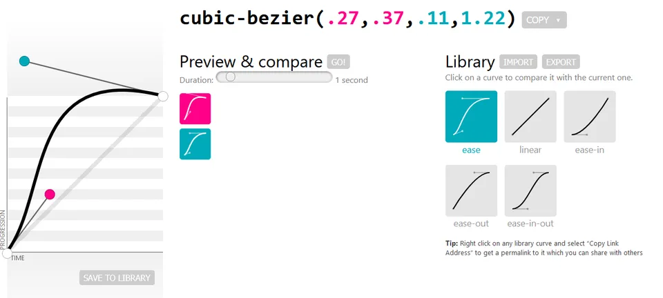
If we ran this with a standard easing function though, like ease-out for instance, we wouldn't get that little jumpy over-correction. We'll need a function that over-corrects

If we then implement this animation on each card, we'll get code like below. Note that I'm breaking out the animation properties for readability though you can certainly in-line those.
.container.animate .card {
    opacity: 0; // ensures the card invisible jumping in

    animation-name: jump-in;
    animation-delay: var(--animation-delay, 0);
    animation-duration: 500ms;
    animation-direction: normal;
    animation-iteration-count: 1;
    animation-fill-mode: forwards;
    animation-timing-function: cubic-bezier(0.27, 0.37, 0.11, 1.22);
  }
The other thing to note is the var(--animation-delay) in there. We have not talked about that yet but it is key to making this whole thing work.
The initial Codepen used .card:nth-child(1)) to select each individual card. From there they position each one accordingly. You end up with something like below where --gap is a top-level variable value for how far offset each card is from another:
.card:nth-child(1) {
    rotate: 10deg;
    translate: calc(-2 * var(--gap));
}

.card:nth-child(2) {
    rotate: 5deg;
    translate: calc(-1 * var(--gap));
}

.card:nth-child(3) {
    rotate: -3deg;
}

.card:nth-child(4) {
    rotate: -10deg;
    translate: var(--gap);
}

.card:nth-child(5) {
    rotate: 2deg;
    translate: calc(2 * var(--gap));
}
What we can do here then is add in our --animation-delay as a way of staggering when our cards jump in. We can also add in addtional top-level variables for further control. We'll call one --delay which controls the base delay before our animation begins at all. We'll call another --offset which is the amount of time until the next card's animation begins.
Here are how the first two cards are implemented. You can follow the pattern from here to get the other cards animated.
.card:nth-child(1) {
    --animation-delay: calc(var(--offset) * 1 + var(--delay));
    ...rest
}

.card:nth-child(2) {
    --animation-delay: calc(var(--offset) * 2 + var(--delay));
    ...rest
}
I added a little bit of javascript so that the replay button works but otherwise that's pretty much it! Here's that pen again:
See the Pen Jump Cards - CSS Only by @cwoodward10 on CodePen.
Adding some spice
If you've looked at my implementation of jumping cards on my portfolio page (on desktopt that is), you'll see that I've added a hover state to expose each individual card better. That's actually also pure CSS. Let's get into how I added that in.